With an unpredictable future due to COVID-19, health systems must leverage data to drive decision making at every organizational level. Data visualization dashboards allow health systems to optimize their data and create a data-driven culture by displaying large, real-time data sets in an easy-to-understand dashboard.
Health systems that rely on dashboard reporting maximize their data in three important ways:
1. Time to value. Decision makers do not have time to wait for manually-created reports; dashboards quickly convey information so leaders can make swift decisions.
2. Data democratization. Leveraging a central source of truth, dashboards allow leaders at every level to access the most updated, accurate data.
3. Digestible data. Analysts can configure dashboards to highlight important figures and trends, so high-level leaders can understand complex data without diving into spreadsheets.
 Download
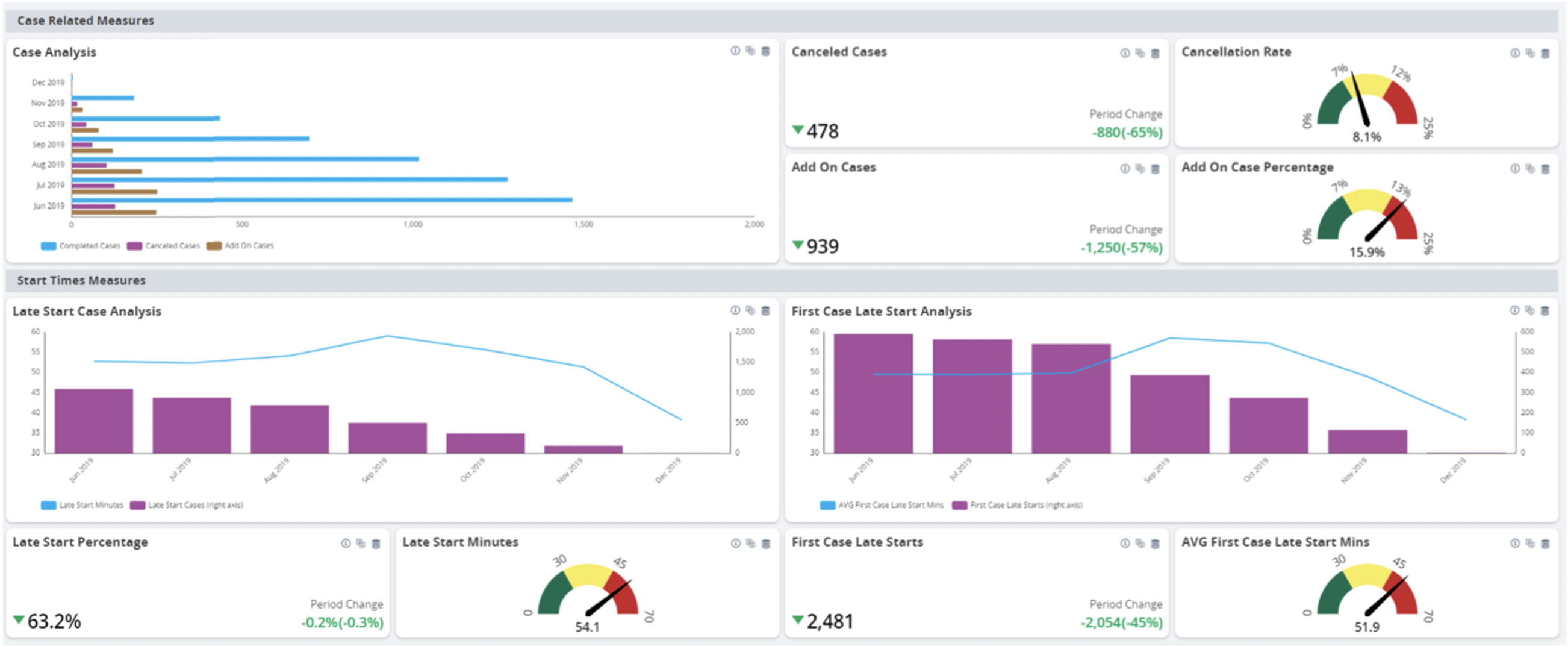
Data is everywhere in healthcare, but it often falls short of adding value for health systems. While most healthcare organizations have access to more data than ever—and claim to be data driven or data informed—80 percent of healthcare leaders say their use of data analytics to drive decision making and strategic planning is “negligible.”
Why has the promise of investment in data systems not materialized for some healthcare leaders, particularly as data remains a top asset? While health systems constantly face new challenges, and never more so than in 2020 with the COVID-19 pandemic, one thing remains constant—health systems need access to comprehensive data in their enterprise data warehouses (EDWs) to drive decisions that ensure organizational success.
One explanation for health data’s unrealized potential may be the challenge of converting data into actionable information. Aggregating and organizing data is only part of the process. Surfacing data as actionable information in the best visualizations is as vital as deriving the data itself. This process adds context through the identification of trends and relative comparisons, most effectively done through data visualization tools like dashboards.
Dashboards play a critical role in driving data-informed decisions. As information management tools, dashboards quickly convey large sums of information and highlight important figures for decision makers. For example, the Health Catalyst Leading Wisely® tool surfaces consolidated data and allows for data sharing via easy-to-understand dashboards (Figure 1).
Without dashboards, decision makers or analysts must manually collect, correct, transform, and analyze data regularly to reveal actionable insights. While data scientists, analysts, and advanced data users understand this analysis process and the associated tools, the process is not as clear for other leaders in the organization. The lack of accessibility to a standard analytic process is a roadblock to a healthcare organization’s data assets reaching their full potential.
Spreadsheets and documents show analysts an organization’s data, but their primary purpose isn’t visualization. Visualization dashboards enable aggregated data analysis for leaders at every level without requiring the technical analysis skills that complex spreadsheets typically demand. These dashboards feature drill-down capabilities that allow users to dive into the nuances of the data. For example, in addition to reviewing high-level discharge data, users can examine key indicators to compare discharges at each location and then drill further into one of the locations to see the discharges at the provider or department level. Without a dashboard, these drill-down reporting capabilities can be time-consuming and costly and include licensing fees, significant development requirements, and independent data governance.
Data visualization dashboards can also act as tools to keep disparate departments aligned with a health system’s greater goals. Because dashboards are based on the curated and standardized data—already defined and agreed on by the organization’s leadership—they can provide users with an interactive view of key performance indicators (KPIs) without incurring additional data governance oversight. Dashboards can vary in their focus, but all are intended to highlight areas of interest (e.g., if a department is on track to reach its KPIs) through relevant visualizations.
Dashboard reporting tools give leaders at every level constant visibility across their organization, empowering systemwide data-driven decisions. When health systems leverage the information in their EDW through data visualization dashboards, they maximize their data’s value in three key ways:
Healthcare leaders have to make decisions quickly; waiting days or weeks for a specific data analysis allows new issues to arise, meaning the initial data analysis is outdated or irrelevant by the time it’s completed. Dashboards seamlessly and automatically convey large sums of information in a short amount of time so leaders can make quick, accurate decisions.
Delayed decision making can lead to wasted resources, confusion across the hospital, and stalled care delivery to patients in need of medical attention. Analysts can tailor dashboards for specific groups so that the right data visualization dashboards release the correct data (sometimes previously hidden in the EDW) and surface actionable insights specific to a group’s need. Visualization dashboards offer immediate access to varied, comprehensive data sets so decision makers can rely on up-to-date data without manual effort. Dashboards also act as a timesaving method to view data for leaders who do not have the time (and often lack the technical expertise) to dive deep into data analytics.
From a central source of truth, the EDW, dashboards also achieve data democratization—the ability for leaders at every level to access accurate data to drive informed decisions. This availability of information is the foundation of self-service analytics, which means leaders at all levels can access and leverage analytics in decision making without relying on a data analyst.
A common data challenge for health systems is how to widely disseminate information to leaders while maintaining data integrity. Typically, when data is available throughout an organization, leaders worry about the integrity of the data and whether team members are using the latest numbers. With the EDW as the central source of truth, leaders can rest assured that everyone is using the latest data to drive decisions.
As part of data democratization, self-service dashboards replace manually generated, recurring reports, allowing dedicated analyst resources to focus on higher-value analysis and data governance. Information is always available and up to date and requires minimal maintenance, making dashboards invaluable tools for maintaining improvements over time.
Dashboards simplify complex data and highlight variations, making the data easy to consume and digest for decision makers at every level. The use of appropriate visualizations and comparisons over time or among departments or locations calls attention to outliers without the need for repetitive, cumbersome analysis. Most dashboarding systems allow users to set and track goals, and more advanced systems will integrate statistical functions like process control and forecasting. These functions allow users to see the expected impact of an intervention based on the health system’s history. With simple visual options to match the data sets—such as run charts, bar graphs, or scatter plots—decision makers are empowered to view, monitor, share, and report performance information over time, regardless of their technical skill level.
Additionally, data visualization dashboards make data more digestible by allowing automatic notifications so that leaders can rely on alerts, rather than checking granular data regularly. For example, a user can configure an automatic notification to interested parties when data violate rules or breach thresholds. These notifications also improve the likelihood that leaders will take appropriate action at the earliest opportunity.
Dashboards are often an untapped resource for many health systems that fail to maximize their data and analytic capabilities. Data visualization dashboards allow organizations to replace manual reports with interactive information systems, increasing their digitization and freeing their valuable analytic resources to perform strategic analysis. Based on commonly defined measures, dashboards allow leaders to quickly and easily explore, and interact with, common data to discover and track issues.
Along the data journey, some leaders may underestimate the vital role dashboards play in driving data-based decisions that allow health systems to thrive in an unpredictable market. Effective dashboards extend the data beyond a spreadsheet and help leaders gain confidence, freeing them from second guessing their decisions. When leaders at every level feel confident their decisions are based on accurate, common measures from one source of truth, they can get back to what matters—ensuring organizational success so they can continue improving outcomes and helping patients attain optimum health.
Would you like to learn more about this topic? Here are some articles we suggest:
Would you like to use or share these concepts? Download the presentation highlighting the key main points.