Health systems can leverage the predictive potential of machine learning to improve outcomes, lower costs, and save lives. Machine learning, however, doesn’t inherently produce insights that are actionable in the clinical setting, and frontline clinicians need information that’s accessible and meaningful at the point of care. Thoughtfully designed visualizations of machine learning insights are a powerful way to give clinical users the information they need, when and how they need it, to support informed decision making.
A design framework for machine learning visualizations addresses three key questions about who will use the decision-support insights and how:
1. People: who are the targeted users?
2. Context: in what context or environment do they work?
3. Activities: what activities do they perform?
 Download
As healthcare delves further into the predictive potential of machine learning, the industry is appreciating how this advanced analytics capability enables accurate, timely risk scores and improved resource allocation for lower costs and better outcomes. Leveraging machine learning insights in healthcare, however, is often more complex than in other applications, where it’s becoming commonplace (from navigation and weather forecasts to entertainment and retail suggestions).
Due to the complexity of health data and the healthcare setting, machine learning doesn’t automatically deliver insights in ways that clinicians can swiftly and accurately act on. To fully leverage the value of machine learning in healthcare decision making, developers must make machine learning insights actionable for clinical users. Visualizations are a key tool to turn these valuable insights into action. This article describes some key elements of meaningful, actionable machine learning visualizations.
A meaningful visualization requires the collaboration of a multidisciplinary team (e.g., data scientists; user experience designers; and clinical experts in patient safety, including usability testing and focus groups with actual targeted users). Team members contribute their combined expertise to address three central questions to build a framework for visualization design decisions:
The multidisciplinary team combines their expertise to bring deep understanding of people, context, and activities to the visualization. This comprehension is critical, as it ensures that the visualization meets clinical users where they work (on the frontlines of care) and addresses their needs in the most effective, direct way. If the visualization isn’t maximally accessible and useful to clinicians, they won’t adopt it into their workflow and benefit from machine learning’s valuable decision support.
Figure 1 shows an example of a machine learning visualization for patient safety that predicts potential patient safety events.
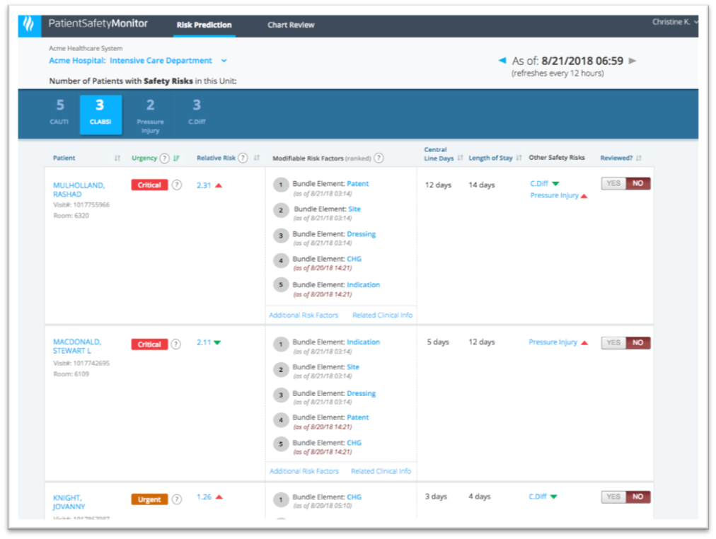
The patient safety tool in Figure 1 is designed to help clinicians on a hospital unit act on machine learning insights and prevent or reduce the risk of specific patient safety events. Machine learning algorithms (predictive models) determine which patients are at risk for which safety events and stratify their risk accordingly; designers put these insights into the visualization in a way that helps frontline clinicians act on them.
For example, a predictive model can indicate that a particular patient has a 27 percent risk for a central line-associated bloodstream infection (CLABSI). But for this insight to be actionable, frontline clinicians need to understand how that risk probability compares to other patients in the unit. A risk probability score alone doesn’t help unit clinicians determine which patients have the highest risk and need their attention first. Even stratifying patients into standard risk categories (e.g., high, moderate, and low risk) doesn’t give care teams enough insight to make informed decisions.
To optimize risk reporting, the clinical experts on the visualization development team can suggest concepts and language for the user interface that clinicians are already familiar with. Instead of ranking patients according to a high, moderate, or low risk score, the visualization uses terminology that’s more meaningful to clinicians; it ranks patients by urgency and relative risk (critical, urgent, timely, and routine). These more familiar clinical concepts, as Figure 2 shows, help clinicians better plan in which order to address each patient on their unit.

By using the clinicians’ language, the visualization helps the users determine which patients to work on first to lower the risk of a safety event. Clinicians are familiar with relative risk (Figure 3), and framing patient risk this way allows them to compare patients within a unit and easily understand if one patient is twice as likely as other patients to experience a particular safety event. The visualization above still includes the patient risk score but puts clinically actionable insights in the primary view.

Once the clinical user has determined to address a particular patient, the visualization can help her determine what to do. In the example of the potential patient safety event (Figures 1 and 2), the visualization shows not only risk factors that are contributing to the patient’s risk, but also modifiable risk factors, ranked by potential impact, allowing clinicians to address these risk factors to manage risk.
From identifying patient risk to suggesting preventive actions, machine learning can add invaluable insight to healthcare decision making. To fully optimize these insights, healthcare app developers must present them in ways that communicate to clinicians precisely how urgently patients need attention, as well as modifiable risk factors they can address for the most impact. Visualizations that consider the people, context, and activities for these machine learning insights will deliver critical information to clinicians when they need it, in a way the makes the most clinical sense.
Would you like to learn more about this topic? Here are some articles we suggest: