Health systems rely on data to make informed decisions—but only if that data leads to the right conclusion. Health systems often use common analytic methods to draw the wrong conclusions that lead to wasted resources and worse outcomes for patients. It is crucial for data leaders to lay the right data foundation before applying AI, select the best data visualization tool, and prepare to overcome five common roadblocks with AI in healthcare:
1. Predictive Analysis Before Diagnostic Analysis Leads to Correlation but Not Causation.
2. Change Management Isn’t Considered Part of the Process.
3. The Wrong Terms to Describe the Work.
4. Trying to Compensate for Low Data Literacy Resulting in Unclear Conclusions.
5. Lack of Agreement on Definitions Causes Confusion.
As AI provides more efficiency and power in healthcare, organizations still need a collaborative approach, deep understanding of data processes, and strong leadership to effect real change.
 Download
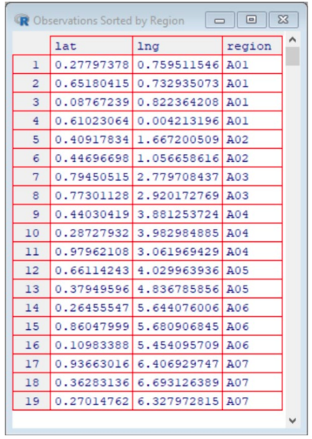
This report is based on a 2019 Healthcare Analytics Summit presentation given by Jason Jones, Chief Data Scientist Officer, Health Catalyst, entitled, “Getting to the Wrong Answer Faster: Shifting to a Better Use of AI in Healthcare.”
Data and analytics can be the driving force behind the successes or failures of a health system. To transform healthcare delivery, data is critical—but only if the data leads you to the right conclusion. Wrong conclusions within your analytics can cause suboptimal outcomes for patients and wasted attempts to utilize artificial intelligence (AI) in healthcare.
Commonly used analytic methods—particularly with AI in healthcare—can often lead analysts and leaders to unknowingly draw the wrong conclusions. Therefore, it is imperative that data leaders understand and leverage important strategies and tools to derive the right conclusions and recognize the wrong answers.
Leaders in healthcare have a significant amount of power with the use of AI/ML; yet, with the same data sets, different leaders can draw completely different conclusions. Therefore, data leaders and analysts have a responsibility to act as stewards of data and help colleagues and team members use data correctly so they can arrive at the right answers faster. It is not uncommon for data users to arrive at the wrong answers, but have no idea, because the answers still look aesthetically pleasing. That’s why data stewards play a key role in overseeing appropriate use, and display, of data.
Before using any form of AI in healthcare, the key is to first identify the problem that needs to be solved. It is recommended that AI/ML projects have at least two years’ worth of historical data, a statistical process control chart that clearly identifies the population, and a clearly defined outcome.
One of the first mistakes organizations make with data and AI/ML is leveraging AI/ML without the proper foundational data, which inevitably leads to the wrong conclusions based on insufficient data and wasted resources that can take years to recover.
When organizations have laid a strong data foundation, AI/ML take raw, tabular data (Figure 1) and turn it into something people can use to make decisions (Figure 3).
Another step in the journey to find the right answer is to understand which data visualization tool is right for your data sets. The right data visualization tool will radically change the way people consume, see, and then interpret data.
For example, if someone was interested in buying a house, but heard there were higher rates of cancer in certain areas of the region, that person might want to view the cancer rates vs. location data in order to identify which areas have higher rates of cancer (where to avoid buying a house).
The data could be displayed myriad ways. In the example below (Figure 1), the cancer by location data is displayed in a tabular list that shows each location where cancer has been reported, grouped into geographic regions. For example, there are four reported cancers in region A01, two cancers in region A02, etc.
Another way to display the same data is to use a scatterplot (Figure 2), a powerful data visualization tool that allows users to more easily consume and interpret data.
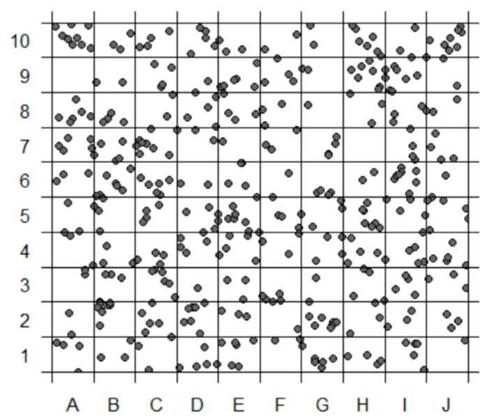
A person can clearly identify cancer-free regions, empowering data-driven decisions. The right visualization tool also allows users to take the data one step further (Figure 3) and identify trends, patterns, and clusters in the data to target opportunities for improvement.

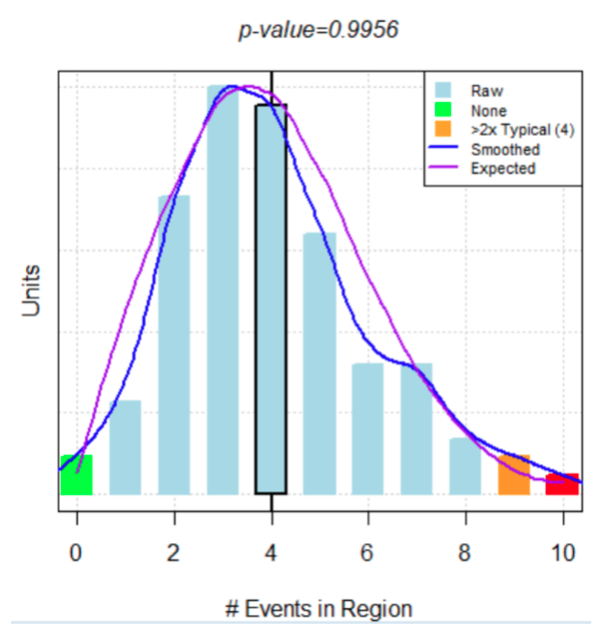
However, were the person to use AI/ML, in addition to using data to make a decision, she may find that there is an even better way to display the exact same data. A bar chart (Figure 4) overlaid with an algorithm that predicts cancer rates, the blue line represents the bell curve based on the actual data (cancer rates based on geography) and the purple line (AI/ML) is what was expected if there was no relationship between cancer diagnoses and geography. Because the bell curve of the actual data aligns so closely with the AI/ML bell curve, there is strong evidence that there is no relationship between cancer diagnoses and region. Therefore, someone looking to buy a house in this region should not base their decision on cancer rates by region.
The cancer rates by region example illustrates that the data never changed, only the way the data was displayed. It is crucial for data leaders to understand how data visualization tools can drive people (or health organizations) to the right answer or the wrong answer.
For example, the East Africa Institute of Certified Studies’s (ICS) attempted to improve academic performance of Kenyan kids in grade school. At first, ICS provided more books (rather than the one book for the entire classroom), flip charts, and teachers. The changes made no difference. In fact, ICS saw an increase in inequity. The initial hypothesis was that the kids who benefitted from the books were already high performers, and with their own book and more individual attention from teachers, the high performers will keep outperforming the low performers, increasing the disparity.
A leader at ICS mentioned the findings to a colleague at the World Health Organization (WHO), who suggested school absences due to worm-based illnesses might be the problem. It turned out that many of the students were missing a significant amount of classroom time due to worm infections. ICS decided to implement deworming days at school, an opportunity for students to safely seek treatment for their illnesses at school. Overtime, ICS saw school absenteeism decrease by 25 percent and income levels increase by 20 percent levels over 10 years.
Although ICS’s first attempts at academic improvement led it to the wrong answers, the leadership collaborated with leaders at WHO and were willing to try something new in an attempt to get to the right answer. Because of its collaborative efforts, humility, and commitment to improve academic performance, ICS identified the right answer—deworming programs at schools—that caused massive change for Kenyan kids, both now and in the future.
Although AI in healthcare seems ubiquitous, and even straightforward, there are common challenges that arise. Five in particular occur as data analysts and leaders try to leverage AI/ML to get to the right answers :
AI/ML bring power, utility, and efficiency to the healthcare world, but it does not replace the invaluable role that humans play. Analytic processes require guidance from data leaders and stewards in order to draw the right conclusions.
Specific AI/ML tools and techniques are both useful and attainable, but they are not enough for healthcare organizations to arrive at the right answers. In order to eliminate the wrong answers faster and ultimately find the right answer, health systems need a collaborative approach, an understanding of data and analytic processes, and leaders who remove common barriers and stay focused on moving forward.
Would you like to learn more about this topic? Here are some articles we suggest:
Would you like to use or share these concepts? Download the presentation highlighting the key main points.